Using Doddle USS, UI is built with smaller individual utility USS classes that each have a single responsibility. Classes such as .flex-row that change the flex-direction property to a row and nothing else.
There is no need for an ever growing library of USS classes as any style can be achieved by combining individual utility classes. The only exception to this, is if support for seasonal/event themes are desired. In that case, a base theme file is required, and all colour/sprite properties should be contained in separate style sheets which pull from USS variables in the base theme. This requires more boilerplate set up which is not needed or desired for all projects. This will be covered below.

Below are prerequisites that are needed when creating every new piece of UI. Before proceeding, ensure all steps have been followed in Installation.
- Create a new UXML document by Right Click/Assets > Create > UI Toolkit > UI Document
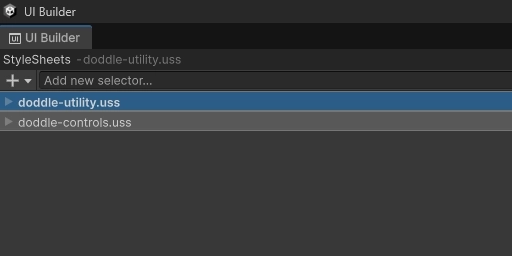
- Link doddle-utility.uss, and any other style sheets in the top left StyleSheets selector
- Select '+' dropdown
- Select 'Add Existing USS' and navigate to where doddle-utility.uss is located. By default, it will be in Assets > Doddle USS > Style Sheets > doddle-utility.uss
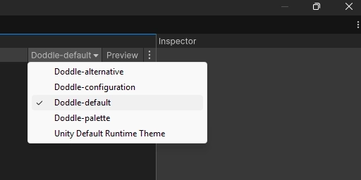
- Change the theme dropdown to the desired theme. By default, Unity will set the theme to 'Unity Default Runtime Theme'. Any utility class that relies on USS variables (background colour, border colour, image tint, text colour) will not work unless the theme inherits from both 'doddle-configuration.tss' and 'doddle-palette.tss'
- Select the theme selector dropdown in the top right
- Select the desired theme or 'doddle-default.tss'
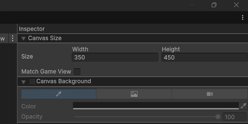
- Set the canvas size larger than the default. This will not affect set element sizes. This will help the UI Builder simulate how the UI will look when the canvas only has that much available space
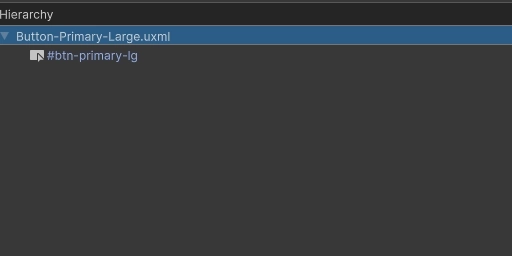
- Select the first element in the hierarchy panel. This will be in the format: 'YourUXMLDocumentName.uxml'
- Adjust the canvas size and/or options in the top right of the inspector
UXML
USS
USS
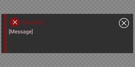
Above is an example of a simple error notification. Let's break it down, and take a look at the major points of focus:
- The lack of
'style='tags - indicating there are no inline styles. - All classes referenced are present in
doddle-utility.ussexcept those containing colours - this is for future theme change support. This step isn't necessary, nor is it desired in many smaller projects as it opens you up to a lot of boilerplate, however when your project starts growing, this step will become more useful. - Templates are being used for re-useability - just like a prefab, UI is componentized into re-usable chunks.
- No string content is hard coded into the UXML template - this ties into the previous point of creating componentized pieces of UI to allow for re-usable chunks.
Let me explain the relationship between the UXML file, the style sheet, the theme file and why there are so many USS variables.
- The UXML has the building block elements in the layout.
VisualElements, etc. - The style sheet only has classes that reference USS variables in the theme file for both colours and sprites.
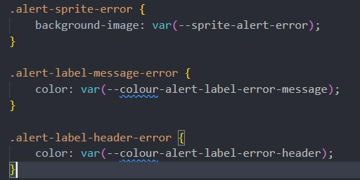
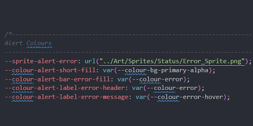
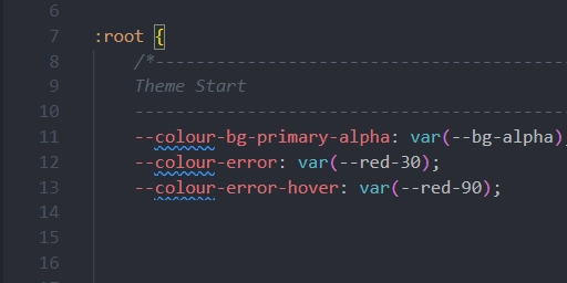
- The theme file has 2 layers of USS variables. The first are variables for individual elements in specific UI such as the error label in the alert. The second are the theme variables that define a consistent set of colours used across the project.
- And lastly, the defined theme pulls from
doddle-palette.tss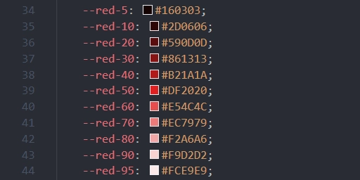
This setup seems like a lot or work just to set a few colours and sprites. Could you instead use Doddle USS' colour utilities .text-red-30, or set the stylesheet class to point directly to --colour-error, or even --red-30? Absolutely, it is up to you how involved the implementation is. However, I will list a few positives this extensive setup offers:
- Say down the line, the designer changes their mind and wants the error colour to be
#B21A1A. That's now a simple change to--colour-errorin the theme file instead of every piece of UI. - What if only the error colour for alerts should change? Well that's a simple change to
--colour-alert-label-error-header. - What if the hex needs to be changed for
--red-30and not just for error colours? That's also a simple change to--red-30. - And lastly, event/seasonal theme support. Duplicate the theme file, change the sprites, and the theme colours like
--colour-error,--colour-primary, then release.
- It's quicker - No need to open up a new style sheet, and create a bunch of custom classes for each new UI.
- Easier to understand at a glance - You can see all styles applied to the element from the top of the inspector rather than matching USS classes to elements, or scrolling between all of the expandable sections looking for styles.
- No inline styles - Utility classes mimic the ease of use/comfort of inline styles, but none of the drawbacks. Less likely to cause bugs with overwritten styles, and more performant.
- You won't have an ever growing USS library - Besides potentially adding colour and sprite references, your USS class list won't be growing indefinitely.
- Use BEM (Block-Element-Modifier) naming convention where possible to reduce complex USS selectors. However, complex selectors are necessary in some instances because child elements in controls such as toggles are inaccessible.
- Avoid the use of '*' selector, It means that every potential element will be tested against the selector which can be very costly as the number of elements increases. The ':hover' selector is also a '*' selector, however this one is a necessary evil.
- Try to predefine as much of your hierarchy in the UI builder ahead of time so there is as little generation at runtime as possible. Creating the UI on
Awake()/Start(), and hiding it withVisualElement.DisplayNone()until needed is more performant than creating the hierarchy at runtime and destroying it when no longer needed. - Avoid the use of inline styles as much as possible. Inline styles override classes, which makes debugging issues more difficult, use more memory, and block the ability to swap themes.
On this page