This site is currently under construction. Check back later, but in the meantime, check out the GitHub repository on what Doddle USS is, and join the Discord server. When complete, this will be released on the Unity Asset Store.
Build Fast, Maintainable UXML Templates
A utility USS framework for Unity's UI Toolkit with all the lessons from web-dev. Build reusable UI with components missing from Unity like gradients, and box shadows with theme support.
A Smarter Way to Work with UI Toolkit
Familiar for countless roles. Built for Unity's UI Toolkit.
'%20fill='white'/%3e%3crect%20width='19.9352'%20height='36.5089'%20transform='matrix(-0.516625%200.856212%200.856214%200.516621%2038.127%2035.7793)'%20fill='white'/%3e%3cpath%20d='M14.1787%2096.6564L63.8221%20125.786L114.409%2096.9391L95.3044%2085.8641L74.2615%2097.7699L53.3824%2097.7699L32.7296%2085.8641L14.1787%2096.6564Z'%20fill='white'/%3e%3cpath%20d='M69.3594%202L118.921%2030.7953V89.4934L99.8161%2078.1414V54.053L89.2947%2036.056L69.3594%2024.704V2Z'%20fill='white'/%3e%3cpath%20d='M58.8384%202L9.00009%2030.5184V88.3859L28.1048%2076.757V53.7762L38.9031%2035.7791L58.8384%2024.1502V2Z'%20fill='white'/%3e%3crect%20x='53.8545'%20y='62.3589'%20width='19.9353'%20height='35.4404'%20fill='white'/%3e%3c/svg%3e)
Built for Unity but Familiar to Web Devs
Doddle USS is built specifically for Unity with all the loved lessons and inspiration from popular CSS frameworks like Tailwind CSS and Bootstrap. This makes getting started with Doddle USS easy for contributors from all aspects of development.
'%20fill='white'%20stroke='white'%20stroke-width='5'%20stroke-linecap='round'/%3e%3cellipse%20cx='71.7031'%20cy='100.906'%20rx='14.5'%20ry='14.5'%20transform='rotate(90%2071.7031%20100.906)'%20fill='white'%20stroke='white'%20stroke-width='5'%20stroke-linecap='round'/%3e%3c/svg%3e)
Highly Configurable
We take an opinionated approach to defining UI which allows extensive control of individual properties of specific UI such as border colour, or the look and feel of the entire library like default background colour all at once by only changing only a few variables.

Built in Theme Support
Effortlessly support light mode, dark mode, or holiday theme updates by simply overriding Doddle's default theme and customizing the theme content. No need to change, and dig in every UXML document.

Utility Classes
Doddle USS contains utility classes for every UI Toolkit property all in one style sheet allowing you to build your UI without an ever-growing list of custom classes.
'%20stroke='white'%20stroke-width='10'%20stroke-linecap='round'/%3e%3crect%20x='53.9678'%20y='74.9673'%20width='43.0323'%20height='43.0323'%20rx='3'%20stroke='white'%20stroke-width='10'%20stroke-linecap='round'/%3e%3crect%20width='43.9677'%20height='43.9677'%20rx='3'%20transform='matrix(-1%200%200%201%2053.9678%2031)'%20stroke='white'%20stroke-width='10'%20stroke-linecap='round'/%3e%3crect%20x='53.9678'%20y='118'%20width='43.9677'%20height='43.0323'%20rx='3'%20transform='rotate(180%2053.9678%20118)'%20stroke='white'%20stroke-width='10'%20stroke-linecap='round'/%3e%3c/svg%3e)
Extension Methods & Transition Library
Doddle USS also contains a small, but growing library of extension methods, entry/exit/hover/loop transitions, and templates that can be used to build your UI, quicker, and easier.

Custom Controls
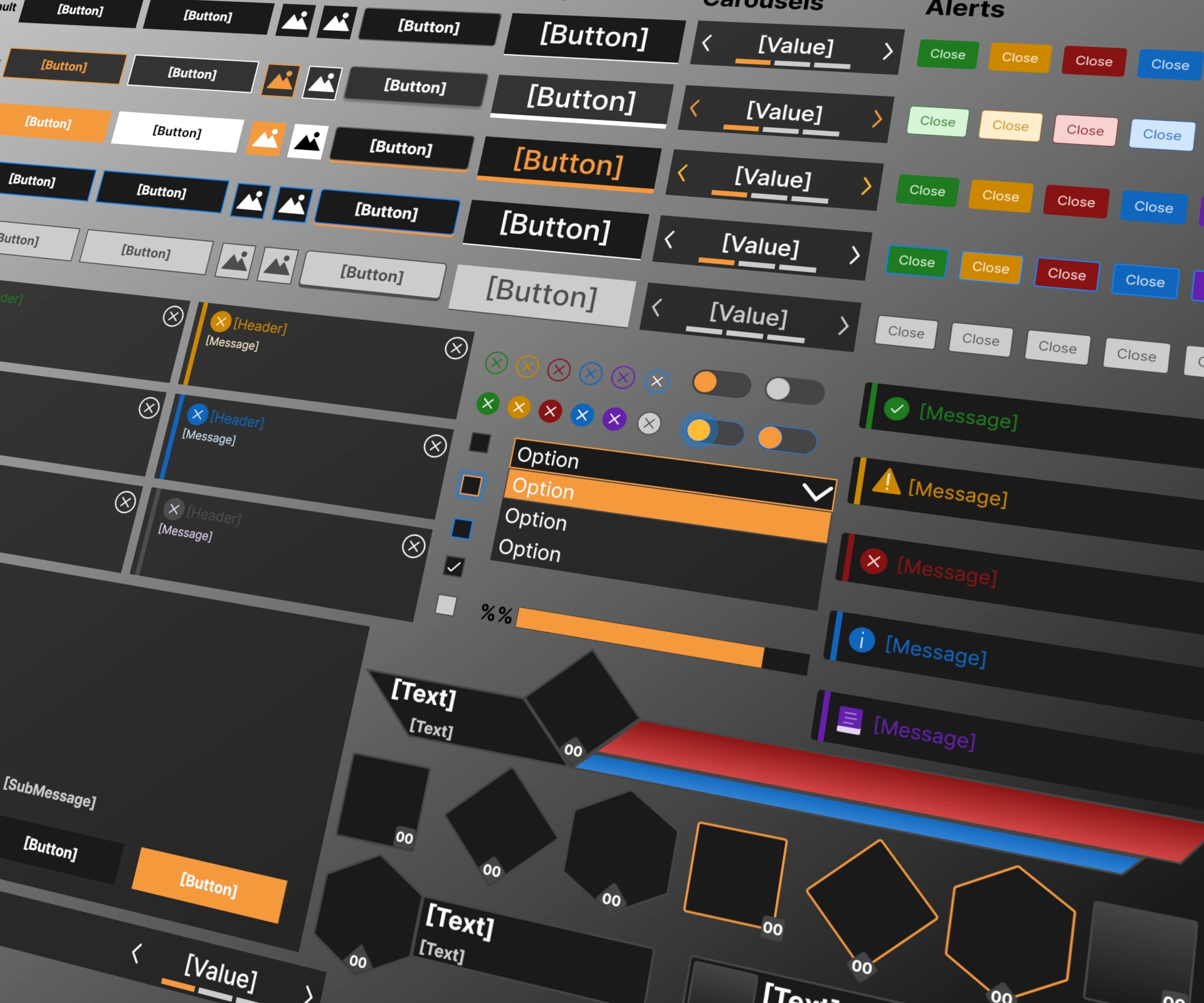
Take advantage of custom controls like box shadows, gradients, toggles, and more that are missing from Unity's UI Toolkit.
Everything you Need to Build UI
Build UI with as little or as much adoption as desired.
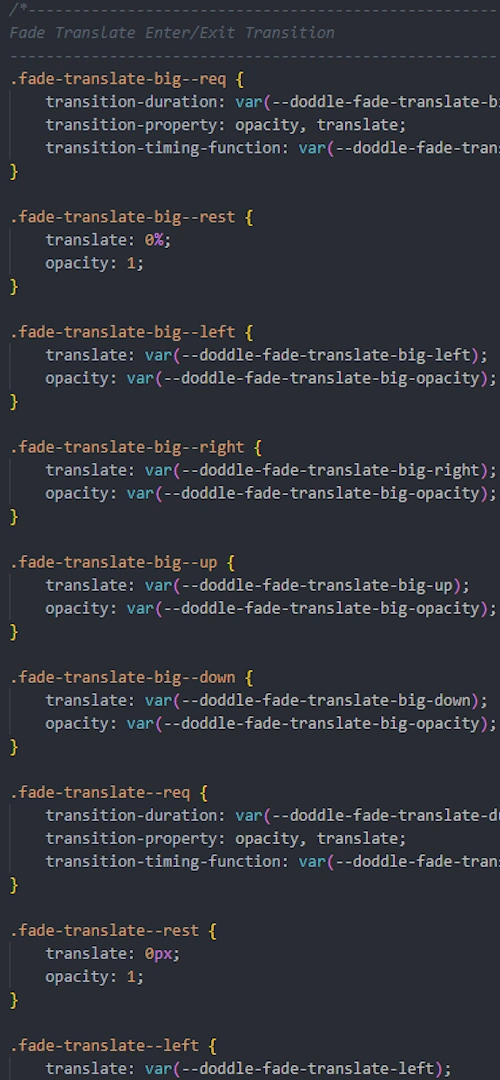
Transition Library
Use our growing library of preset hover/entry/exit/loop transitions. Customize the values without ever having to touch the CSS classes.
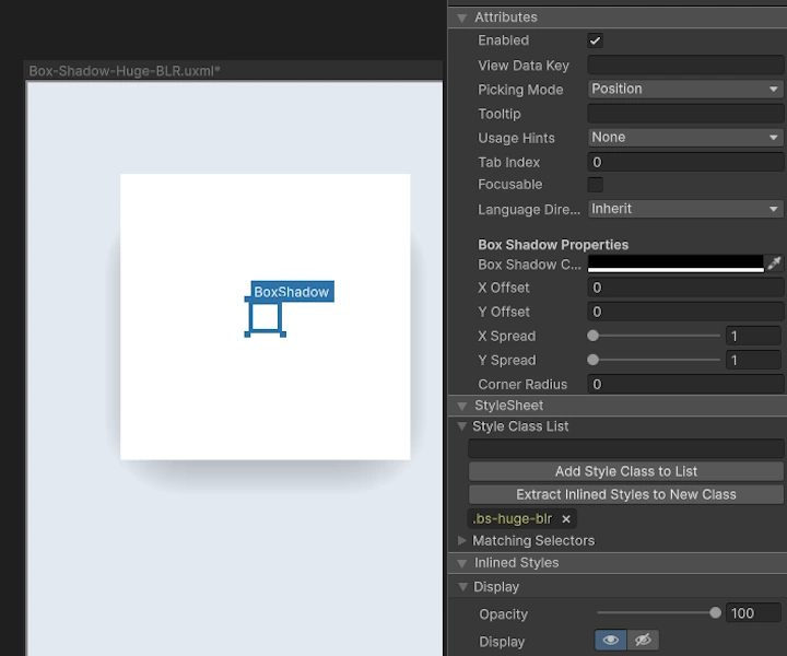
Box Shadows
Use our templates, or build your own box shadows/overlays to add those impactful details to your UI.
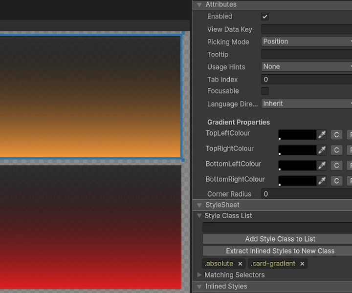
Gradients
Do more with gradients than just Unity's built in text gradient. Add small details to make backgrounds, and UI look polished.
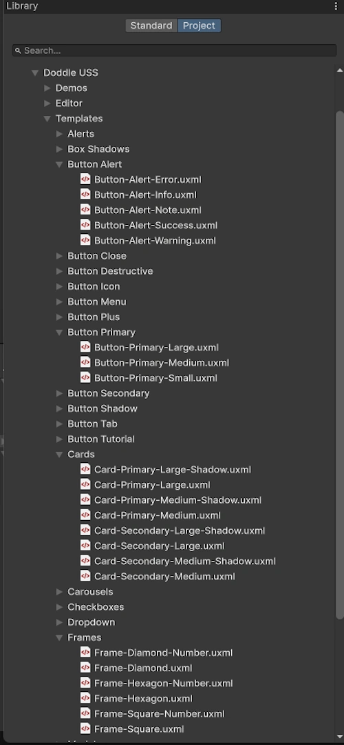
Templates
Rapidly assemble new UI with our library of USS classes, and UXML templates. Doesn't fit what you want? Change the entire library's look and feel with just a few variables.